The possibilities to adjust Nomad appearance are awesome!
But with new icons, Fontscale is not corresponding.
This ends up in tiny icons, tiny text, lots of free unused space.
Scale overall is not the solution, as I have Fontscale on max (I am over fifty ). This will end up in text hidden by other icons and ticks. But still lots of unused space wasted for design, which is critical on tiny devices.
A better solution must be possible like:
-Icon only with tooltip option and better- more compact space use
-text only with better - more compact space use.
I’m okay with the UI interface. I have all settings on small to have more useable screen space, but I do have to wear my glasses after a while.
Without complicating the menu design with too many different options the solution I thought was to be able to scale the menus up while keeping the icons and text the same proportions to each other. You would have to have the tool bars slide up and down and to the side to fit all options on though. But this would give bigger buttons/controls on a tablet screen.
Icons on the viewport obviously can’t have big text, but this behavior never changed.
Most apps don’t have labels on icons.
To get more viewport space, use auto-hide toolbox, I almost enabled it by default.
If you are talking about the buttons at the top of interface and settings menus, that’s the opposite, they reduce the panel height.
I added many options to the settings over the time and the menu was becoming a huge wall of text and found it hard to remember where was each option.
The tool tips are still there, nothing changed. The text size doesn’t scale with font scale but it could be. But in any case having huge font by keeping a low overall scale or panel width is simply impossible.
And I’m not even mentioning localization.
Overall Scale slider does work, but it does cut some of the tools off the left side menu. Having a scroll up and down on this menu activate only when the menu cuts off the screen like the right menu would help the issue.
Stéphane what you have implemented will already do the job apart from this cut off issue.
But it’s not an issue for me and I’m happy with the interface and I don’t like my UI large. But this overall scale slider will probably help people like Knacki.
It complexifies the behavior because the bottom left button have « hold » behavior on top of toggling.
It means I have to introduce a threshold to differentiate between scroll and « holding » button.
If you are using an iPad there is a zoom option in the accessibility settings of the iPad. I know it’s not ideal but it may help a little. Probably not as it’s big and gets in the way.
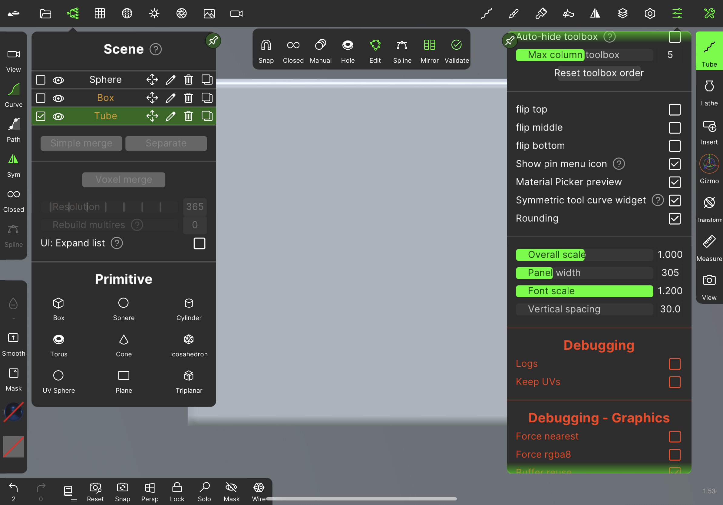
I am talking about those areas marked with red.
Text is not scaling, but quite a bunch space on sides up to next icon. This is inconsistent to other UI.
Scale overall is hiding question mark at “Project Auto Save” which is only at long text and no prob.
Thanks for all feedback and help guys. Really appreciate it.
I readjusted a bit
 ). This will end up in text hidden by other icons and ticks. But still lots of unused space wasted for design, which is critical on tiny devices.